 .
That shows the trend over the baseline (I currently use a 7 year baseline from 2013-2019) of deaths from drug or alcohol overdose (poisoning).
.
That shows the trend over the baseline (I currently use a 7 year baseline from 2013-2019) of deaths from drug or alcohol overdose (poisoning).
This dashboard is designed to help you easily navigate and access a number of datasets that I have created relating to the concept of "excess deaths" in the United States. In the simplest term, "excess death" simply means the number of deaths from a given cause either over or under the number of deaths expected from the cause. Usually this is constrained to a fixed time period such as a year or a month.
A key component of any excess death calculation is what is referred to as the "baseline." The baseline establishes what is considered to be the "normal" number of deaths in a period. There are many ways to establish and/or calculate a baseline but one of the most common is to simply take the average number of deaths in a given period and declare that average the baseline.
For example, we could say that the baseline for deaths from cancer is going to be the year 2015. Meaning whatever number of deaths from cancer in 2015, that is what we will call "normal." And any year that has more cancer deaths than 2015 will have a positive number of excess deaths while any year with less than 2015 will have a negative number of excess deaths. So if 2015 has 1 million cancer deaths and 2018 has 1.2 million, 2018 has 0.2 million excess cancer deaths.
In addition to taking an average, we usually also take the average over multiple years -- to smooth out any years where there were significant deviations (i.e. years in which there were pandemics, natural disasers, etc.). The other thing we do is to adjust for population growth or decline -- usually by expressing deaths as deaths per 100,000 population.
In addition to that, we look at the trend of deaths. Taking a simple average does not tell us what to expect in the future because an average by itself does not caputure the trend, For example, if there were 1 million cancer deaths in 2015, 1.2 million in 2016, 1.4 million in 2017 and 1.6 million in 2018 then the average would be 1.3 million. But 1.3 million is clearly not the number we should expect for 2019, given that 2018 saw 1.6 million
A nice illustration of this can be
FOUND HERE.
That shows the trend over the baseline (I currently use a 7 year baseline from 2013-2019) of deaths from drug or alcohol overdose (poisoning).
This sharp rise year to year in the baseline is then used by my model to predict what to expect in the future, as can be
SEEN HERE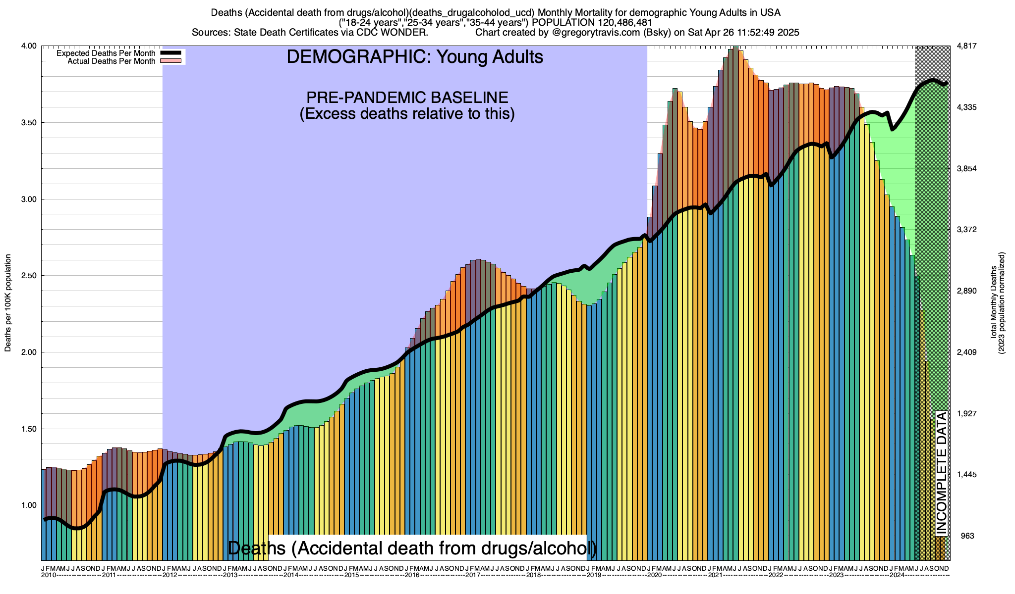
Finally, to get a good handle on whether deaths are rising or falling compared to your baseline, it's not enough to compare year to year. Depending on the cause, deaths from the cause will vary on a monthly timetable. For example, deaths from accidents tend to be at their highest during warmer months (i.e. summer) while deaths from disease tend to be at their highest during colder months (i.e. winter). These are general rules however and not all accidents and not all diseases follow these general patterns. That's why its important to understand the particular seasonality (if any) of what you are studying -- whether it's deaths from ice hockey, influenza, polio or bungee jumping -- when interpeting these graphs. And it's why my excess death model does not look at just year to year variations but compares each individual month to itself over time.
The baseline model that I use incorporates all of these thing. It averages deaths on a monthly basis over a given baseline timeframe (currently 2015-2019), establishes any trends over that baseline and does all of its calculations on a population-adjusted (i.e. per capita) basis. The source to my model is given at the bottom of this document.
We've gone over the basics of establishing a baseline. The next thing to be aware of is that death and the patterns of death are highly variable according to demographic factors. Of those demographic factors perhaps the most influential is age.
I compute excess deaths for four distinct age categories, of which the first is "ALL." ALL is exactly what it sounds like, every age. This is the demographic category that most excess death presentations are based on, including the (now deleted) CDC excess death calculations. But ALL is woefully inadequate. Let's explore why.
The first is that death from any cause is more likely the older a person is. Although much is made of COVID's "age gradient," COVID is not unique in the fact that it impacts people more the older they are. This is true of virtually every cause of death. And not just diseases. For example, deaths from "extreme storms" (i.e. hurricanes, etc.) exhibit the same characteristic "J" mortality curve as influenza, cancer, polio and, yes, COVID.
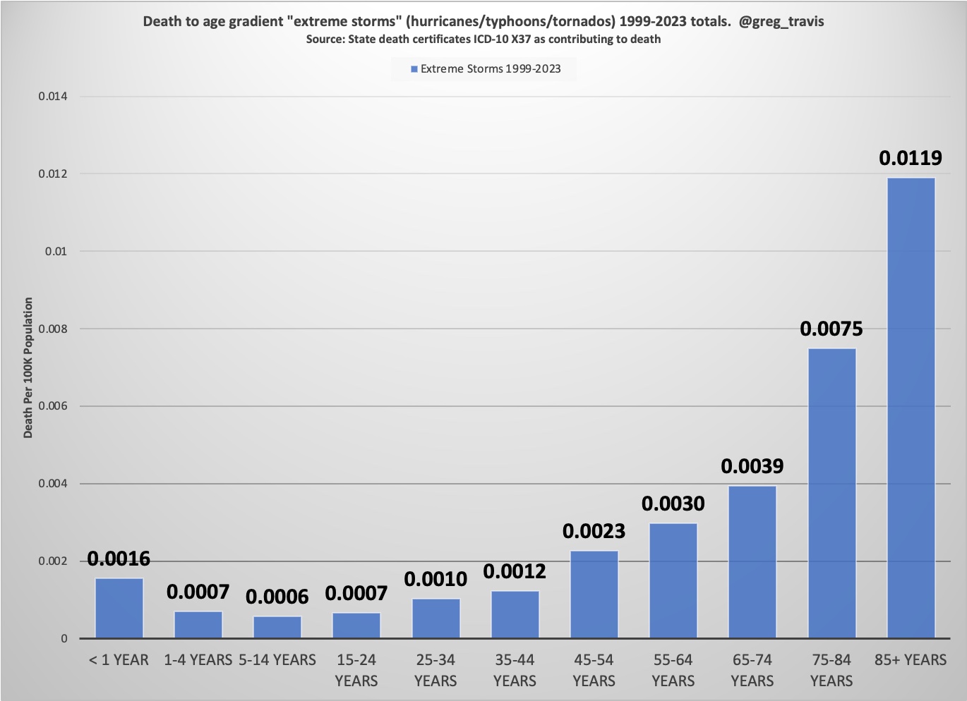
Age not only affects how likely you are to die (the older you are the more likely, simple as that). But if you do die, your age is a strong predictor of what you will die from. Again, speaking in generalities, the older you are the more likely you are to die of a disease. While the younger you are the more likely you are to die of an accident or from self-inflicted harm (i.e. suicide).
This is important because throughout the pandemic we have heard that COVID "only affects the old" and that children, in particular, are practically immune. There is a lot of truth to this -- again the younger you are the less likely you are to die of anything while the older you become the more likely. But it's certainly not unique to COVID -- as I've shown above this is true of everything from cancer to hurricanes. And therefore it's not a terribly interesting or useful bit of information.
A related topic is so-called "age-adjustment" of mortality. Age adjustment is simply a statistical trick that recognizes the age gradient of death and concludes, somewhat horrifically, that the older a person is when they die the less important it is that they died.
I don't do age adjustment -- again, I think it's a morally indefensible practice, particularly when used to minimize the death of millions during a pandemic. Instead I break down my analysis into four age demographics. We've already talked about the first -- and the least useful -- demographic: All ages (ALL). In addition to ALL, I also have what I call OAF -- or "Old And Feeble" -- those persons aged 45 years old or older (I am 60, so the name is self-deprecating). YAH -- or Young And Healthy which is the age range 18-44 years old. And, finally, SCHOOL -- the age range of those people most likely to be in primary or secondary education (5-17 years old).
Determining what a person dies from, when they die, is surprisingly hard to do. When a person dies of disease it's almost never just "a" disease but rather a symphony of conditions that conspire together to ultimately tip the person into death. A death certificate usually has not one single disease listed but many -- the average death from disease death certificate lists 3-6 different contributors. Rarely does a person just die from cancer. Often they die from cancer, together with a set of other conditions such as infections, organ failures, etc. As I said, it's not easy.
I've tried to make the interface to the excess death dashboard as simple as possible from that perspective, without sacrificing some ability to drill down. You can choose from different causes of death, but only at a high level. The choices you have are:
All of the data used in the explorer/dashboard comes from state death certificates. These certificates are filled out and completed at the local (county, municpality, etc.) level and then forwarded to the appropriate state health department for processing. Once the state health department is done it then forwards them to the federal government for analysis purposes. Note that the federal government and even state govermnents do not alter or fill out death certificates. That is done at the local level by county coroners and other empowered officials (hospital physicians, etc.). The states and the feds only record the death certificates and then make them available to the public. That's how I get them
As you can imagine, this takes time. It takes at least four weeks for a death certificate to make it to the federal government after the death. Once the feds have it, it takes a couple more weeks to a month or longer before they make it available to the public.
And the younger the person is the longer it takes. Nobody bats an eye when an 80 year old dies and 80 year old death certificates are processed quickly. When a child dies it is almost always a surprise and usually suspicious. As a result, pediatric death certificates take four months to eighteen months before they are ready for the public.
The process takes even longer if the cause of death is an accident. Again, it's often necessary to rule out foul play in the case of accidental death of a young person. In addition, law enforcement involvement in the case of drug overdoses can make the process take, literally, years sometimes.
Be aware of this when viewing the data. Often you will see strong dropoffs in deaths on the right of my charts and you might be tempted to think "oh, things are getting better." Sometimes they are. But usually, especially if you are looking at deaths among SCHOOL or even YAH demographics, it's simply reporting lag. Some systems like mine attempt to correct for reporting lag by inflating numbers of deaths when the death reports are recent. I don't. It's just too messy to do that and involves too much guesswork.
Another thing to be aware of are cases where there just isn't enough data. Because I look at the month level, not the annual level, the number of deaths from a given cause can be very small. Particularly for deaths from diseases in the very young (SCHOOL) demographic and from states with small populations. In a lot of those cases -- say deaths from disases in children in Alaska in August, there is simply no data at all. This is compounded by CDC's arbitrary restriction on not reporting any deaths at all if there are fewer than 10 in the reporting period. There are a lot of months of the year when fewer than 10 children die of COVID in most states. In those situations there is no way for my software to have enough data to establish reliable trends or even a reasonable baseline. You will see that in some of the trend graphs -- again, mostly in the younger demographics.
Finally, my agreement with the CDC forbids me from sharing publically any state-level data obtained by automation. I may use automation (i.e. a program) to pull national level mortality data (i.e data for the entire United States) but may not use automation to pull and collect mortality data for public consumption from individual states. As a result I must hand-enter state mortality data into my system if I want to share it. The long story short here is that looking at individual states using the excess death explorer will inevitably return a rather dated dataset as I'm not really up for entering each individual state's information more than maybe twice a year.
I hope I have given you enough information here (and not too much!) to help you navigate the explorer and get some good information. Please feel free to reach out to me on Bluesky (@gregorytravis.com) or through email (greg@littlebear.com) with questions.
Source to the excess death model can be downloaded HERE. The model depends on a database of monthly deaths by age category which I build out of extracts from CDC's WONDER database interface. You can connect to the database itself (it's Mysql) at the address fluckmill.dyndns.org with the credentials covidguest and password (same as username) at the standard MySQL port or you can download the data directly from WONDER and build your own database. I can also make the schemas for the database availabke if you want to roll your own
Source to the code that I use to extract the data from CDC WONDER can be downloaded HERE. Unfortunately that code only works for USA data (i.e. not for individual states) so I still have to extract state level data manually through the WONDER Website. This is a process that is as slow as it is error-prone.
Other sources you may find useful. robotit.sh (used with wonder_query.pl to robotically get data from WONDER). loadit.sh (used to load the data extracted from WONDER into MySQL)
If you have the MySQL command line client, you can connect to the database with:
mysql -h fluckmill.dyndns.org -u covidguest -pcovidguest DEATH